Overview of this Section
The Fishwick house is like no other. The building’s site, concept and appearance as well as the novelty, ingenuity and intriguing atmosphere of its interiors set it apart from other houses.
It has been appreciated for many years by Griffin experts and members of heritage bodies, especially if they have been on a guided tour. Most people visiting for the first time are intrigued and delighted by their experience. With successive visits, they are able to see and understand the house’s less obvious design features; for example, the care taken in customising small design details, some of them definitely describable as "quirky", the variety and subtlety of the surface finishes and the changing atmosphere of its rooms under different lighting conditions. Familiarity certainly increases respect for Griffin’s architectural skills and creative genius.
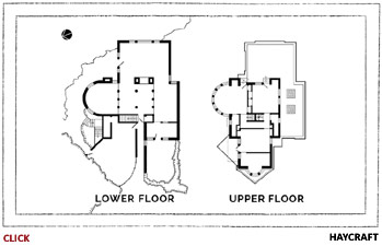
The house is not easy to appreciate from the street because few of its qualities are immediately apparent. It is also difficult to photograph because of restricted sightlines. Further, some of the more esoteric, aesthetic and emotive aspects of its design require explanation. This section is intended to overcome these disadvantages by providing information on the building’s architecture and construction methods and highlighting its most important design features, especially those which would have been seen as highly innovative, ultra-modern and daringly radical when it was built in the late 1920s. Before the arrival in Australia of International Modernism in the late 1950s, very few Australian houses could have been more challenging to established norms and styles. The attachments listed above provide greater detail when this is warranted; for example people who are interested in the layout and spacial aspects of the rooms might immediately like to open .pdf Lower Floor Plan or .pdf Upper Floor Plan.
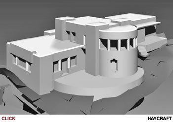
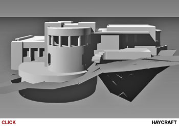
There is now a valuable aid to facilitate understanding of the form of this complex house. As part of creating the watercolour painting shown on this website's homepage, the artist John Haycraft constructed a virtual model of the building. This enabled him to produce several views of it from otherwise inaccessible viewpoints, see Artwork. For more on the development of these see Building and Grounds in this section.
Innovation & Creativity
In order to value fully the qualities of the Fishwick house, it is useful to remember that it was created some eighty years ago in a very conservative, British-oriented society. Architectural design tastes then were almost wholly derived from overseas models or styles and building practices were tightly and bureaucratically controlled. Also, by 1929 Griffin's earlier Castlecrag houses were being derided and criticised. His earlier fame, and the promise of the Castlecrag estate, had already begun to fade.
The house is packed full of design elements which, to a pre-1950s visitor, would have been considered daringly modern or cleverly innovative. For brief descriptions of a selection of these open .pdf Over 40 Innovative & Ultra-Modern Ideas.
Griffin’s innovations were not just confined to practical or technological matters. In every room he sought to produce an intriguing space or a distinctive atmosphere. Many of his most creative initiatives had little utility, being intended specifically to delight the viewer, generate an emotional response or even express an abstract notion. Especially in this respect he departed from the model of the contemporary, emerging Modernist architects, whose “form follows function” edict wholly rejected decoration. Many leading authorities at the time and into the post-war years saw him as the pioneer who introduced modern architecture to Australia; some proclaimed him to be a "prophet", even a "deity". For more on Griffin’s place in the development of modern architecture in Australia open .pdf House as Emblem of Griffin's Modernity.
 |
Regardless of how Griffin might be labelled by architectural historians all recognise his importance in introducing Australians to ideas from the American Midwest - the hotbed of architectural innovation at the time. Also, he and his wife Marion were the first to encourage Australians to understand and respect the natural landscape, especially its distinctive trees, flowers and native bushland. Much of the interest in the design of the Fishwick house arises from Griffin’s use of elements which were at that time highly unusual and ultra-modern but which later would become common in domestic architecture. Six notable examples follow to convey the extent, scope and atmospheric impact of the many resourceful and inventive ideas expressed by Griffin in the house.
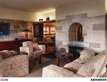
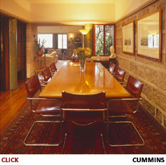
| • Open plan design. The most striking feature of the house’s lower floor is a very early and effective use in Australia of a so-called open plan living area; its entrance hall, lounge and dining room merge to form a very large space which flows freely around the massive central fireplace. In contrast, the usual house plan at the time and for decades later isolated each of these rooms off a central hallway. |
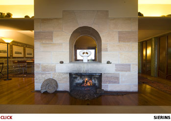
The house's monolithic central fireplace dominates its open plan ground floor living areas. |
Griffin had previously designed similar open plan living areas in some of his large Midwest houses. In fact, architectural historians there continue to debate with some passion whether he or Frank Lloyd Wright can lay claim to the idea. [1] Certainly Griffin was its pioneer in Australia where even progressive architects did not adopt it until two decades later. The concept remained obscure locally until revived in around 1950 by the early International Modernists, most notably Harry Seidler to whom many architectural authorities wrongly continue to attribute it. [2]
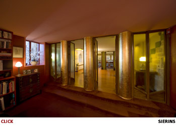
• Split level living areas. Another ultra-modern element introduced in the design of the house’s ground floor living area was variation in its floor level. The study was accessed down a short set of steps which were set across the entire width of the room. The study could be opened fully to the entrance hall through four pairs of double glass doors, further expanding the open plan living area. Again, this concept did not become common until mid-century. With the doors closed, the drop in the study's floor level, its low ceiling and its small intriguingly shaped windows produce a snug, cave-like ambiance.
• Built-in cupboards. Griffin was criticised by some Castlecrag house residents for his lack of practicality in providing for their day-to-day needs, especially the dearth of sufficient well-designed storage space. However, in the Fishwick house this requirement had been very carefully considered. In all but three of the house’s rooms, cupboards and storage areas were planned as part of the building’s structure and specifically designed for particular uses. Some examples will convey their variety and inventiveness. Each of the adjoining large bedrooms had two tall, deep wardrobes which interlocked to form a dividing wall between them and provide excellent soundproofing. As well, the second bedroom had two very large high-level cupboards providing over 1.5 cu. metres (54 cu ft) of storage for rarely used bulky items such as suitcases. The ensuite bathroom had a tall cupboard with eight narrow shelves for small toiletry and cosmetic items. The cupboard in the maid’s lounge was large enough to conceal a wash basin with hot and cold water and a full-length mirror. The study had a deep floor-to-ceiling cupboard for files and stationery. Behind what appeared to be a door in the dining room was storage for glassware which doubled as a servery from the kitchen.
• Integrated garage with sliding doors. Most Sydney suburban properties at the time had a driveway beside the house leading to a side or rear garage. Such a layout was impractical in the Fishwick house because of its block’s wedge-shape and very narrow street frontage. Further, there was no room for on-street parking in the tight circle of The Citadel. Griffin solved this problem by excavating a very large, deep chamber in the sandstone bedrock to create a multi-purpose garage/laundry/utility room wholly within the house’s structure and opening directly onto the street. At 33 sq. metres (355 sq ft) the resulting space can still comfortably accommodate a large car, laundry area, work bench and many storage cupboards. The garage employed another most unusual element: a set of six suspended sliding glass doors fixed to each other by hinges. When opened for car access, the doors concealed themselves inside the building by sliding along a curved overhead track, thus requiring no base rail.
Building & Grounds
The watercolour painting of the house on the homepage conveys that it is built of stone, two-storeyed, flat-roofed and most unusual in form. However it cannot fully convey the complexity of the building. Its faces are highly articulated, some having prominent semi-circular elements. The five reinforced concrete slabs, which are its main structural elements, perform multiple roles, serving variously as floors, ceilings, terraces and window “eyebrows”. Fortunately, in order to produce the painting the artist, John Haycraft, first developed a virtual model of the building from which the two images shown below were derived. These greatly clarify its form and layout and are reproduced with his kind permission. (For more of Haycraft's work see the Images of House section.) For a fascinating and vivid personal remembrance of visiting the house and its grounds written by Griffin's wife, Marion Mahoney Griffin, and preserved in her "Magic of America" memoir, open .pdf Marion Mahony Griffin Describes the Fishwick House
| • Form of house. This image is from the north east. On the left is the lounge, the house’s largest room with its picture window overlooking Sydney’s Middle Harbour. Its door leads to the large terrace above the gardens while its ceiling slab forms the roof terrace which has spectacular views. The dominant feature is the tall, protruding, semi-circular façade which houses the main bedroom and, below this, the study. The main bedroom and second bedroom both have short stairs accessing the roof terrace. The house’s lower floor dining room, kitchen, bathrooms and large entrance hall are not visible. | |||
| This image is from the north west. On the right is the maid’s wing. External stairs lead to the small maid’s terrace. Off this are the maid’s lounge and bedroom which has a semi-circular alcove with an elevated garden overlooking the street. Below these rooms and opening to the roadway through sliding doors is the large garage/ laundry/workshop area which is not visible, being sunken into the natural sandstone. Also not visible are the tunnel-like entrance way and kitchen courtyard. For the layout of the house’s eleven rooms and its four outdoor leisure areas see the Lower Floor Plan or Upper Floor Plan. | |||
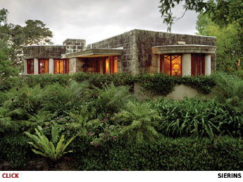
The house sits on a street-level platform of natural sandstone; however, it overhangs the platform’s edge so that the building's eastern foundations under the lounge are in fact on the second terrace level below. All visible walls, the rock supporting the house and the area’s natural overhangs and boulders are of the same sandstone so that the building appears to rise out of the bedrock into which it is integrated. As a noted architectural writer and photographer put it: “It is designed to play a subservient role to the natural landscape...it juts out into the bush in the manner of a sandstone outcrop”. [3]
Because of its highly unusual design, bushland setting, heritage value and important place in the evolution of modern Australian architecture, the house attracts many visitors, mostly on organised tours. Casual visitors without access are at a great disadvantage because very little of the building is visible from the street; it reveals itself only gradually as the viewer walks around. The following description of the house, its native garden and the neighbouring reserves follows the sequence a member of a tour group walk would typically experience.
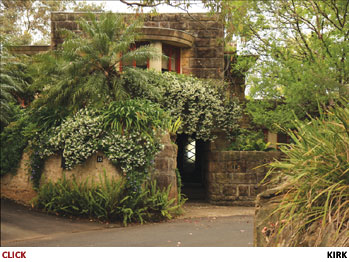
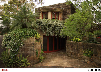
• Street view. Visitors entering Castlecrag head east towards the harbour along the main road which follows the peninsula's relatively flat ridge line. Off this they enter The Citadel which is a short, narrow cul-de-sac. At its end a deep cutting in the natural sandstone tightly circles an “island” of natural bush beyond which stands the Fishwick house.
The site is wedge-shaped, its street frontage being only seven metres (23 ft) wide. It falls sharply from the road through five levels of terracing, broadening as it descends to measure 35 metres (113 ft) wide at its lowest level where it is contiguous with Griffin’s Buttress Reserve. [4]
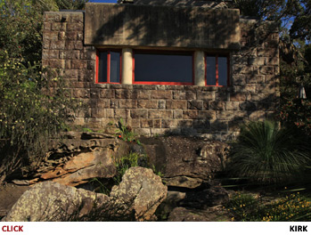
As can be seen by opening .pdf Lot Plan, the building sits tightly in the narrowest section of the block. Constructed entirely of large, roughly finished sandstone blocks, it attracts immediate attention by looming above the road. Its façade comprises only a set of garage doors, a long, dimly lit narrow tunnel and a stone wall up to eye level. Above is an elevated prow-shaped concrete structure housing the window box which is built in front of the only clearly visible room. This room seems to be very small and semi-circular with oddly decorated windows. The tunnel is the house’s entrance way which opens directly from the road, there being no footpath. Visitors’ initial impressions of the house when viewed from the street generally are that it is most unusual but not as grand, attractive or welcoming as they might have expected. [5]
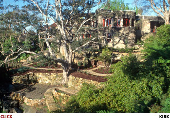
• Side view. Viewers are usually more impressed when they move onto the property and are able to view the northern elevation of the house. Its two storeys of sandstone blocks appear massive. Close inspection reveals an extraordinary design feature: in order to subordinate the building to its landscape, Griffin carefully excavated a large amount of the block’s bedrock close to the street and sunk the construction almost two metres (6ft 7in) into it. In fact, in many parts of the building's lower walls natural sandstone is an integral part of the building's structure.
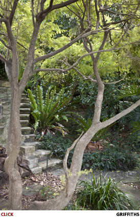
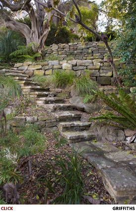
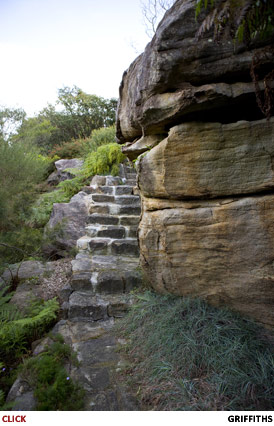
• Terraced grounds. Visitors can walk around a looping sandstone path over 90 metres (290 ft) long which descends the four sets of stone steps linking the block's five terrace levels. This walk reveals extensive native gardens and dry stone walls. As the path crosses its lowest level it is entirely surrounded by Griffin-designed reserves; it is like being in a private piece of bushland with dense native foliage, backdrops of sandstone overhangs and massive, dramatically weathered boulders.
 |
 |
 |
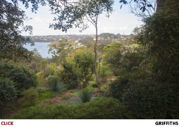
• Rear view. Continuing around the path then climbing narrow steps back to the upper three terrace levels allows the house’s eastern elevation to become visible. This is dominated by the lounge's large picture window. The degree to which the building is integrated with its site now becomes most apparent. Many of the lower parts of its rear façade and its visible foundations can be clearly seen as segments of the natural stone formation.
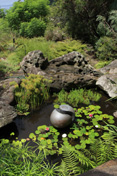
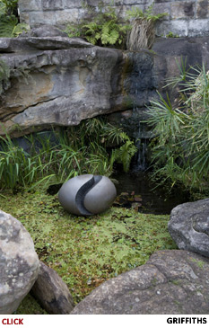
Compared with the remainder of the block, the terrace area directly below the lounge window is relatively flat. Once the site of formal garden beds and lawn, this area now accommodates a large native garden of trees, shrubs and wildflowers. When the garden of exotic plants was removed during the landscape restoration, the drainage point of the house’s main stone platform was revealed. Capitalising on this good fortune and perpetuating its natural function, a small waterfall was created which appears to be fed from a stream beneath the house; its water tumbles into a garden pond surrounded by large stone slabs found on the block. [6]
Interiors
Griffin was a mature architect in his early 50s when he designed the Fishwick house. Although he had completed many hundreds of projects, this commission demonstrated that he still continued to challenge himself in order to create extraordinary buildings. Further, at last he had an accommodating, progressive client with a large budget who allowed him to express his creative genius, especially in the house’s interior.
| Even the most cursory glance at the plans of the house will disclose that it was complex in structure, large and spacious. [7] It had eleven rooms; the living areas being on the lower level and the bedrooms, bathrooms and maid’s quarters upstairs. It had a very large, integrated garage which incorporated a laundry area, workshop and storage space. There were also four separate outdoor sitting or entertainment areas, each with a different aspect to the prevailing weather conditions. Further, there was a roof-top terrace accessed by an internal circular stairway. [8] To see the room layouts in detail open .pdf Lower Floor Plan or .pdf Upper Floor Plan. |
The plan of the two-storey house is complex with open plan living areas, a maid’s wing, eight external doors, four outside sitting areas and a built-in garage/laundry/utility area. |
Each of its rooms was unusual and most contained arresting, unexpected and sometimes quirky elements. Because the plans cannot adequately display Griffin’s inventiveness, a general description of the interiors follows; however, the full extent of his creativity can best be appreciated by a detailed, room-by-room description, for which open .pdf Room Details & Features.
Griffin lodged the plans and specifications for the house with Willoughby Council in mid 1929. [9] It is clear that there were later amendments to these; for example, the study below the main bedroom was not shown on the original plans. Also, the wardrobe bulkhead between the main and second bedrooms was shifted north, presumably to reallocate space. The following overview of the interiors describes the house in its “as built” state.
• Lower floor. Reversing the almost universal custom of the time, Griffin located the house’s utility rooms and maid’s quarters at the street front and its main living areas at the rear. This layout, coupled with its relative isolation at the end of The Citadel, allowed the residents’ social and living areas to be housed in an unusually quiet setting with excellent views over local bushland reserves and Middle Harbour.
| The entrance hall, lounge and dining room spaces were contiguous and positioned around the massive central fireplace. Griffin had pioneered this so-called open plan layout in some of his large American Midwest houses and others in Castlecrag, but its use on such a scale, with such inbuilt flexibility and with such dramatic effect was unprecedented. By opening or closing combinations of eight pairs of glass doors, the entire lower floor space could be controlled; at the extreme, its spacial orientation could be shifted from east/west to north/south. With all doors opened, say for a large social event, the flow of uninterrupted area, including the study, was very large - some 112 sq. metres (1200 sq ft). |
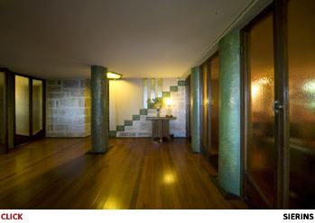
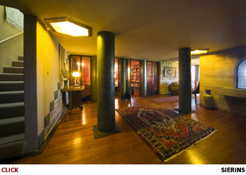
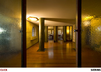
The large entrance hall showing some of its remarkable pillars, the sets of study doors and the back of the monolithic fireplace. |
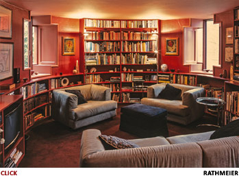
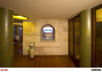
| No doubt to demonstrate how technologically up-to-date he was, Griffin planned to provide the grand entrance hall with separate booths for a radio, telephone and vacuum cleaner. These plans were abandoned when it was decided to excavate deeply into the sandstone slab under the main bedroom in order to accommodate the study. This move created a very early example of what is now called a split-level living area. This sunken room, called by earlier residents the library or family room, had very thick stone walls which kept it cool in summer and warm in winter. |
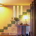
Stepping down into the semi-circular study is to enter a quiet retreat - a wonderfully atmospheric room. |
Relative to the other rooms in the house, the kitchen was small. This followed the edict Griffin applied in all the Castlecrag houses: if a small kitchen was well designed and functioned efficiently, then a large one was not necessary. It has been reported that he argued with many clients that a small kitchen can even be more efficient than a large one; his coup de grace was that American trans-continental Pullman railway trains served hundreds of people for many days from kitchens smaller than those he had designed for their houses.
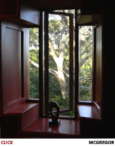
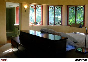
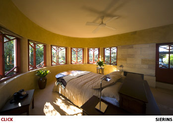
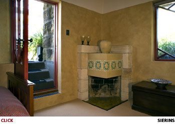
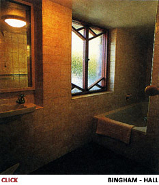
| • Upper floor. The upper floor plan was dominated by the protruding, semi-circular main bedroom. It had seven sets of double casement windows; some overlooked the bushland reserves, others revealed glimpses of the harbour. These allowed sunlight to enter the room throughout the day, even in winter. [10] This room also had its own sandstone fireplace, a door opening onto the roof terrace and an ensuite bathroom with a sunken bath – both very modern and unusual features in Australia at the time. Many visitors find this bedroom to be the most elegant room in the house. Dr Anne Watson, an architectural historian and past curator of decorative arts and design at Sydney’s Powerhouse Museum, said in concluding an evocative description of the room, “It is like no other”. [11] |
The seven double windows in the semi-circular main bedroom track the passage of the northerly sun. The room has an elegant fireplace and an external door leading up to the large roof terrace. |
The upper floor contained a second large bedroom with a very unusual fireplace and a door opening onto the roof terrace. There was also a second bathroom similar in design to the main bedroom’s ensuite, presumably for the use of children, visitors and the maid. The spacious maid’s wing had its own bedroom and separate lounge with a radically designed fireplace. She also had her own separate entry stairway and a sunny terrace.
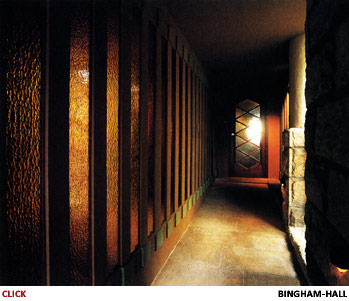
| • Entry progression. The walk from the roadway into the house’s entrance way tunnel, through its front door into the entrance hall, past the free-standing fireplace and across the lounge towards the picture window with its panoramic harbour view has been called its "entry progression" by Professor James Weirick, amongst the world’s most respected authorities on Griffin’s work. He has glowingly described a viewer's likely reactions during this progression as “one of the magical experiences of Castlecrag”. [12] |
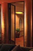
Entry is through a tunnel flanked by 26 amber glass mirrored panels. Through the translucent front door can be seen a distant source of natural light - the view from the lounge is of an arm of Sydney Harbour. |
A sense of Griffin’s skill in handling space, colour, lighting, textures and decorative finishes and an appreciation of the atmosphere of the house can be gained from the following detailed and intentionally anecdotal description of that progression by Wanda Spathopoulos. This long-term resident of Castlecrag recalled her first impressions on visiting the almost-finished house:
"It was a two-storey house on the southern flank of the Tower Reserve, yet it could not be said to dwarf the rocky outcrop. Although the obvious material for its construction was stone, you were confronted from the street, not by a solid facade, but by surfaces broken into various shapes, squares, rectangles and curves, with recesses and angled walls. As you entered under the shelter of the upper floor, you could not escape the feeling both of confinement and curiosity at what might be hidden beyond the narrow entrance. This feeling increased as you passed through a tunnel, its walls surfaced in gold glass, leading, for all you knew, into some deep Aladdin's cave.
Instead, on being released at the other end, it was as if you had passed through the rock to the back of the cave, with all the space now opening before you. You were in a large hall, fronting a massive two-way fireplace. Through an arched aperture in the centre of the chimney, inset with a pane of glass, light was reflected from a window at the far side of the lounge room, an ingenious combination of fantasy and function...You were drawn past the fireplace to the light of the lounge room, where a picture window overlooked the bush and the harbour." [13]
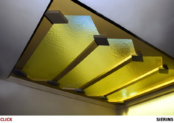
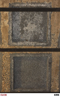
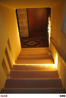
Indeed, when visitors first see the house from the roadway, the amber-coloured glow seen at the end of the entrance way tunnel is sourced from the lounge window some 40 metres (141 ft) away. On entry, the entrance hall ceiling drops to just two metres (6 ft 7 in), but the space is no longer confined; this hall is the second largest room in the house despite having as its sole function the capacity to welcome visitors. Almost all its light enters through amber glass. Both of the side walls of the room are formed by the eight pairs of glass doors. Light also filters in through three small amber glass wall panels in the stairway which has its own skylight, also amber coloured. The only additional light after dark is from two large hexagonal amber glass light fixtures set in the ceiling. Particularly notable is the “forest” of eight tree trunk-sized floor to ceiling pillars which dominate the space. These are coloured in the deep greens and browns of Australian eucalypts, with metallic gold highlights. [14]
When moving towards the brighter light and passing under a very low bulkhead, suddenly and dramatically the space opens and the ceiling height rises to over three metres (10 ft). This, the lounge, is the largest room in the house and is flooded with natural light from six windows and a glass door which opens onto a spacious sandstone terrace. Although the room is given great strength by its scale, walls made of large exposed sandstone blocks and thick pillars which edge each window, it is nevertheless dominated by the monumental free-standing fireplace. Spathopoulos again:
"Griffin seemed to tease us, throwing walls up in our faces, pulling us through tunnels, then suddenly, with a wave of his hand, revealing the surprise he had in store. By exploiting one aspect of the design, Griffin enhanced another."
Griffin is increasingly recognised as a pioneering modern architect; he believed that architectural problems required fresh thinking rather than adherence to traditional approaches. This concept embraced not only the design of a building, but also extended to its construction. The Fishwick house demonstrates clearly his conviction that, where practical, new materials and technologies should be explored and, if effective, adopted unhesitatingly.
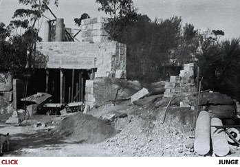
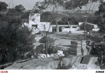
In Sydney at the time, most houses had red brick walls, hardwood floors with tongue-and-groove floorboards and pitched roofs with Marseilles tiles. In contrast, the basic structure of the Fishwick house was certainly radical. Its exterior walls were made entirely from locally quarried sandstone blocks. These supported five reinforced concrete slabs, four of which had spans which were very large for their time. They were shaped to act variously as ceilings, upper floors and terraces or decks. The customary wooden flooring of bearers, joists and floorboards was used only for the living area floors and those of the main and second bedrooms. As described below, there were no voids below the lower level floorboards so it was extremely difficult to find access ways for most of the house’s service pipes and cables. This characteristic was the source of many maintenance problems.
• Foundations & ground-level floors. Almost all of the perimeter walls of the house were bedded directly onto the underlying sandstone platform, thus providing a very stable structure. In a number of cases, these load-bearing walls were positioned deeply into carefully cut recesses in the stone so that the building was truly of, and embedded in, its landscape.
• Walls. The exterior stone walls were tuck-pointed with a sand, lime and cement mortar and left to weather naturally. This mortar was mixed to be “soft” - low in cement, high in lime - to ensure that the pointing rather than the sandstone blocks would crack with expansion or settlement. These tuck-pointing cracks could then easily be repaired.
Some upper-level walls are not load-bearing. These were made of common house bricks and then rendered with pigmented mortar. The resulting surfaces were very roughly textured; their colouring varied room to room but was predominately in organic tones of brown and ochre. [16]
• Roofs & Ceilings. Griffin’s attachment to flat roofs is clearly evident in Castlecrag where they were specified in the covenants for all houses to be built on the Estate. [18] They were a major expression of his principle that houses should be subservient to the landscape, low in profile and positioned to respect other residents’ views. Steel-reinforced concrete slabs were cast in situ to act as ceilings and floors and to provide flat outdoor recreation areas. Griffin’s plan specified five of these, some with spans which were very wide for domestic architecture at the time. In a further very early and inventive initiative, they were designed with carefully specified sloping surfaces. Their thicknesses decreased across their spans in order to direct stormwater runoff to flow towards central drain holes. These are clearly delineated in .pdf Griffin's Plans of House.
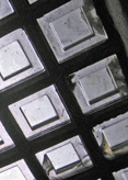
The slabs' design included another innovation which allowed wider spans. Incorporated in them was a system Griffin described as “insulating with cellular cores”. Sets of steel rods encased in concrete crossed each other in a four-foot square “waffle” pattern. The square spaces between these were then infilled with pre-cast segments. To reduce the mass of the slabs, as well as to increase their insulating capacity, he moulded these infills from mortar combined with coke breeze which is a light, cheap by-product of the steel smelting process.
Four large slabs were used for the roofs and upper level floors. A small slab which formed a protruding awning over the maid’s semi-circular bedroom windows was extended into the room's interior to provide a cantilevered bulkhead to conceal its indirect lighting.
• Top roofs. To ensure that the external surfaces of the house were uncluttered, Griffin stipulated that no gutters or downpipes should be visible. Water runoff from the roofing slabs was directed to central drain holes then flowed into large internal down pipes made of mild steel. These, and waste pipes from the upstairs bathrooms, descended within the structure. Unfortunately, this was one of Griffin’s least successful ideas. The drain holes proved to be easily blocked. Also, over time, the concealed sewerage and stormwater downpipes rusted. These were almost impossible to repair and caused major water damage to internal surfaces.
| The exposed concrete roofing slabs were waterproofed in a manner which again demonstrated Griffin’s innovative flair, but regrettably also demonstrated his poor appreciation of local building conditions and climate. He had not foreseen the degree of thermal expansion and contraction which occurs in Sydney’s highly variable weather conditions. He held that concrete which cured under water would not crack; therefore the roofing slabs would not require a waterproofing membrane. Each slab was carefully constructed in-situ with a small raised lip along its perimeter. All its surfaces sloped gradually inwards towards a central drain hole. By blocking this hole the entire slab could be covered with water up to the top of its edging lip thus forming a shallow pool in which water would remain until the concrete cured. Unfortunately, over time thermal stresses caused cracking in the slabs and allowed water to enter the structure. For more on the leakage problems and their solution, see the Restoration section. | 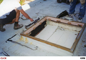
The topmost slab being readied for a new membrane. The raised lip around both the slab's perimeter and the edging of the original fish pool are clearly visible. |
* * * * *
When completed, Griffin’s construction methods produced a solid house with imposing spaces and highly unusual and effective internal features. It has a comfortable internal climate because of the thermal density of the stone and cement structural materials used in most rooms. It does however need heating in winter and has a ducted central heating system. If the house is well-closed on exceptionally hot and windy days the lower-level rooms remain cool. This is especially so in the study, the lower walls and floor of which are effectively of solid sandstone. [19]
Footnotes in this Section
1. On Griffin’s design innovations, the Walter Burley Griffin Society of Australia's website states: "It is now increasingly acknowledged that Griffin contributed a number of fresh concepts to the Prairie School, most noticeably in three respects: his attention to vertical space (a development leading directly to the ubiquitous split-level style post-war houses); open plan living and dining areas dominated by a large central fireplace; and the extensive domestic use of reinforced concrete." (See “Lives and Works” section of griffinsociety.org.)
2. The website of Australia’s most famous mid-century residence, the 1950 Rose Seidler house by Harry Seidler, wrongly claimed that he introduced open plan living to Australia. This error is unfortunately now widely accepted. For example “By Design”, ABC Radio National’s primary architecture and design programme, wrongly stated: "While nearly every house now built or renovated in Australia features open plan living, this concept was new here until the mid-20th century". Broadcast June 6, 2014.
3. Austral Eden Patrick Bingham-Hall 1999. p140
4. The block’s area is 808 square metres (990 sq yd). The internal area of the building is 225 sq m (270 sq yd) with lower floor 130 sq m (155 sq yd) and upper floor 95 sq m (115 sq yd). Additionally, its four outdoor recreation areas cover approximately 73 sq m (87 sq yd).
5. Visitors who can tour the house's interior are almost always very impressed. However, for many who might have made the effort to view the house from the street it would probably not live up to their expectations. One aim in creating this website is to overcome this shortcoming. Also, Willoughby City Council has cooperated in facilitating access to the site through mobile phones by placing QR codes in front of the house and in the the overlooking Tower Reserve.
6. A submerged pump and hidden pipes circulate the water from pond to waterfall.
7. The lounge is the largest of Griffin’s Castlecrag rooms. The entrance hall is the second largest space in the house.
8. The small circular stairway led to a counter-balanced steel door opening to the top roof. It has been shut and sealed to prevent rust and moisture penetration.
9. Original plans lodged with Willoughby Council were dated July 1929. Work started in November 1929.
10. Sydney is at 33 degrees south latitude, so the sun is always to the north.
11. Griffin Our Contemporary Anne Watson Habitus magazine 2011. p192
12. Walter Burley Griffin - A Re-View James Weirick 1988. p11
13. The Crag - Castlecrag 1924-1938 Wanda Spathopoulos 2007. p225
14. To get the strikingly complex textured effect he wanted, Griffin used a sea-sponge to dab the pillars with four layers of paints and glazes of increasing transparency in browns, dark greens and gold.
15. Rimu is a large evergreen coniferous tree endemic to the coastal forests of New Zealand. It is now highly prized and its cutting down is illegal.
16. Scrapings allowed the original finishes in some rooms to be seen and closely duplicated. Small patches were left visible.
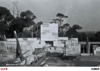
17. Hume Bros was a Melbourne-based company for which Griffin built a multi-story city office block. Early photographs show that solid pipes were also used in the house’s construction but it is not known if they were also from Humes (see Junge pictures in the Images of House section).
18. Griffin took a prominent client to court defending his covenant prohibiting non-flat roofs. He first used reinforced concrete slabs as accessible rooftop leisure areas on his 1911 “Solid Rock House” in Winnetka, Illinois. This is said by the leading American Griffin scholar to be “probably the first such house erected in the Western world”. Walter Burley Griffin - Architectural Models Paul Kruty 2003. p20
19. During the major restoration the study floor and lower walls were "tanked" with a waterproof epoxy material to prevent seepage from the stone into which the room was sunk.

